Artwork Guidelines
Print-Ready Artwork Guidelines
1 What format should my files be in when I submit them for printing?
We work in a PDF (Portable Document Folder) workflow. PDF’s are the most common and preferred file format for submitting digital documents throughout the printing industry. Creating a PDF locks in the fonts, pictures and graphics; increasing the reliability of the artwork file. Please submit all PDF files for printing using our recommended PDF/X-4:2010 joboptions.
1 How do I create reliable PDF files that keep images at a high resolution?
Most of today’s layout programs such as Adobe Indesign have an ‘Export to PDF’ function based on various settings named ‘Adobe PDF Presets’.
Use the PDF/X-4 preset that comes with Adobe InDesign to achieve high resolution PDF files when exporting.
You may preview these settings here: PDF/X-4 Settings
If your version of Adobe InDesign does not have the PDF/X-4 joboptions then you can download the job options here PDFX-4.joboptions
The PDF/X-4:2010 and PDF/X-4:2008 joboptions differ in the PDF version they produce. The 2010 version saves to PDF version 1.6.
1 How do I create 'High Quality PDF Artwork'?
Some important points to follow:
- Ensure that all images have been converted to CMYK colour mode in Photoshop.
- All images need to be of a high resolution of at least 300 dpi.
- Text must be at least 10mm inside of the trim line on all sides to assure that nothing will be trimmed off during the cutting process.
- All images or graphics trimming off the edge MUST be pulled out 5mm beyond the trim line (bleed).
- Outline all fonts when working in Adobe Photoshop or Adobe Illustrator, embed fonts in other programs and flatten all layers.
- In Adobe InDesign convert all your colours on the pallete to CMYK to ensure you don’t use RGB colours or Pantone colours by accident in your artwork.
- Do not use the colour named ‘REGISTRATION’ or ‘ALL’, anywhere in your artwork. Those are used only for crop marks and they consist of 100% of all four process colours (Cyan, Magenta, Yellow and Black).
1 Why do the printed colors look different from the colors on my screen?
In short, printers and monitors produce colours in different ways.
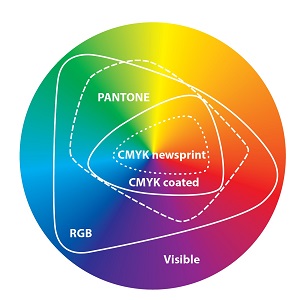
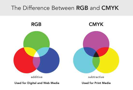
Monitors emit light and use the RGB (red, green, blue) colour model, which usually supports a wider spectrum of colours (GAMUT).
Printers reflect light and use the CMYK (cyan, magenta, yellow, black) colour model, which can reproduce only some of the colours in the RGB range. CMYK generally matches 80% of the colours in the sRGB model.
The image below shows the human eye’s full visible spectrum and also shows the reduced colour range of sRGB and AdobeRGB as well as the CMYK colour range. You will notice that the printing process can only produce a small percentage of the colours our eyes are capable of viewing.
1 How can I simulate the look of the printed product?
The prerequisites to simulate a printing press are as follows:
a) A high quality IPS monitor needs to be used. IPS monitors allow you to view them from different angles will minimal change in appearance.
b) You need to purchase a monitor calibration device and calibrate your monitor regularly as the light bulbs in the back of your screen fade over time just like any other light bulb. After calibration you need to ensure you do not change the brightness and contrast settings as they will invalidate your calibration.
We use the X-Rite i1 Display Pro that costs around $350
c) You need to simulate the printing press or presses as well as the paper type used to print your product.
We use the cold-set web offset method for printing newspapers.
We use the heat-set web offset method for printing catalogues and magazines.
You will need to use one of the following profiles depending on the printing process used:
-
Coldset Uncoated (Newsprint between 42gsm and 55gsm)
- Colour Profile
- Colour Settings for Adobe Products
-
Heatset Coated (High brightness greater than 105gsm)
- Colour Profile
- Colour Settings for Adobe Products
-
Heatset Light-Weight-Coated Improved (Medium brightness between 57gsm and 104gsm)
- Colour Profile
- Colour Settings for use with Adobe Products
-
Heatset Uncoated (High brightness Wood-Free between 60gsm and 100gsm)
- Colour Profile
- Colour Settings for Adobe Products
1 What are crop marks?
Crop marks, also known as trim marks, are lines in the four corners of your artwork indicating where the paper should be cut to produce the correct page size.
These do not need to be in the PDF artwork you provide as our software is guided by your defined PDF trim box. If you decide you need them in your files they need to be at least 5mm away from your artwork.
1 What is an imposition?
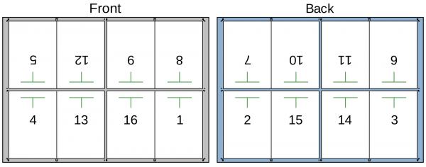
It consists of the arrangement of the printed product’s pages on the printer’s sheet, in order to obtain faster printing, simplify binding and reduce paper waste.
Correct imposition minimizes printing time by maximizing the number of pages per impression, reducing cost of press time and materials.
To achieve this, the printed sheet must be filled as fully as possible.
Example:
1 Do I have to impose my artwork myself?
No. All your PDF files are imposed automatically by our prepress workflow software.
1 What is bleed?
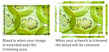
The trimming process process of a magazine or a catalogue at high speed can produce slight variations. This can result in fine white lines on the edges of your publication if you don't provide extra image (bleed) to be trimmed off.
The term bleed is used for all objects extending past the trim border of your document. If any element on your document layout makes contact with the trim box you will need to provide bleed.
Bleed needs to extend 5mm past the PDF trim box.
1 Should I convert my files into CMYK?
Yes! This is extremely important.
Although our prepress software should automatically convert any RGB images contained in your submitted files to CMYK automatically, it is not recommended as the colour of the converted images may be different from your intention.
In rare instances with newer PDF files that contain multiple image layers we have seen our conversion software fail to convert an RGB image to CMYK.
1 My photographs print out too dark. What could be the cause?
You always should adjust your images to compensate for printing on paper. You can use an image editing program such as Adobe Photoshop to achieve this in combination with the colour profiles located in the DOWNLOADS area.
Your monitor might also be the reason for this misrepresentation. It is imperative you have a calibrated monitor when creating artwork for printing. A monitor that is set to high contrast and brightness can lead a designer to darken a photo and lead to a darker print result.
1 What resolution should I use for the photos and graphics in my artwork?
We recommend that all images be saved at 300 dpi in the final size that they will be used.
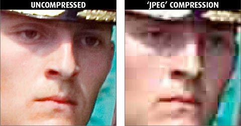
Some people download images and graphics from the Internet in preparing their print publication. These Internet images usually have a resolution of only 72 dpi in order for the web pages to load quickly. Avoid these graphics, as they will appear pixelated when printed due to JPEG compression and your will not be happy with the end result. If you need to use these then scale them down by 50% and that will increase the resolution to 144dpi ( 72dpi / 0.50)
1 What are the differences between RGB and CMYK colour spaces?
“RGB” refers to the primary colors of red, green, and blue. “CMYK” refers to the primary colors of pigment: cyan, magenta, yellow, and black. The CMYK colors are used on printing presses to make any hue possible for “full color printing.”
The issue in commercial printing projects arises from the fact that the RGB colour space does not correspond exactly to the CMYK colour space. It is therefore possible for you to see colours on your computer monitor that cannot be reproduced by an offset printing press.
1 1. Supply all content in the colour pages as CMYK
Our printing presses reproduce colour with the use of four inks – cyan, magenta, yellow and black (CMYK).
Non-CMYK content (such as RGB, Pantone, Lab etc.) might be converted to CMYK by our prepress software but may suffer a significant colour shift resulting in dull, w
ashed-out colours. Many designers unintentionally include Pantone spot colours in their files so we attempt to convert these to CMYK.
If your publication requires printing of a specific Pantone spot colour or spo varnish then this needs to be quoted for and requested from the Spotpress sales representative.
The specific Pantone ink needs to be ordered from the ink manufacturer and a different printing process needs to take place on our end.
Your order to Spotpress needs to clearly identify the fact that you need a specific Pantone spot colour or spot varnish.
1 2. Supply all content on the Greyscale page PDF’s in Black only.
Greyscale pages are also known as black & white pages or monochrome pages. To ensure your pages do not contain other colours check for them by using Adobe Acrobat Professional (not Reader) under Tools > Print Production > Output Preview > Show: All > Untick ‘Process Black’.
1 3. Coldset printing (Uncoated paper/Newsprint): DO NOT supply graphics that contain areas with a total ink weight exceeding 215% or a black ink weight exceeding 80%.
Any ink applied to areas exceeding these values will rub-off to other areas of the page AND/OR transfer to the adjacent page (set-off) AND/OR pass through the paper to the reverse side of the page. The end product will look dirty and graphics including advertisements and photos may be affected.
1 4. Heatset printing (Coated paper/Gloss): DO NOT supply graphics that contain areas with a total ink weight exceeding 300% or a black ink weight exceeding 95%.
The end product will look dirty and graphics including advertisements and photos may be affected.
1 5. Each PDF file must contain only a single page.
This means that a 24-page publication must consist of 24 individual PDF files.
Our automated software relies on you to name your files as per the Spotpress Prepress Department's instructions.
These instructions are typically sent to you upon commencement with Spotpress.
Alternatively call the team on (02) 9549 1186 or email them at prepress@spotnews.com.au
1 6. DO NOT save your final artwork in Adobe Photoshop.
All 'vectors' imported into Adobe Photoshop will be converted to 'rasters' resulting in loss of quality and sharpness.
Vectors are lines and Rasters are pixels.
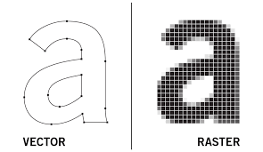
Fonts need to be kept as Vectors to provide a sharp printing result.
Design
1 1. Keep your graphics and text well within your final product size.
Graphics and text close to the edge may be trimmed off due to mechanical variation during printing or binding.
1 2. For broadsheet newspapers, DO NOT place graphics with a heavy ink-weight in the region that will be folded.
Ink applied in this region, is subjected to intense mechanical pressure and will set-off to other areas of the page and to the adjacent page.
1 3. For untrimmed tabloid newspapers, DO NOT place graphics with a heavy ink-weight close to the top or bottom edges of the page.
Ink applied in this region, is subjected to intense mechanical pressure and will set-off to other areas of the page and to the adjacent page.
1 4. If you are using bleed, extend your image 5mm past the three open edges of your final product size.
5mm is the safe margin of mechanical tolerance.
1 5. If you are using bleed, do not provide bleed on the side of the page that is on the spine.
Any bleed applied to this side may be overprinted by the adjacent page.
Images
1 1. DO NOT use low resolution images taken from the internet.
They are only 72dpi and they will reproduce poorly.
1 2. DO NOT save images in the JPEG format. Save all your images in TIFF or EPS format.
Saving your images as JPEG may result in poor quality print reproduction.
1 3. DO NOT use images scanned from printed material such as newspapers and magazines.
The reproduced images will contain a Moiré pattern unless you have first removed it in Adobe Photoshop.
1 4. Scan and save colour images at 250dpi, greyscale images at 150dpi and line-art at 600dpi.
When scaling the image upwards you will need to increase the resolution proportionately.
1 5. For coldset printing on uncoated stock (i.e. newsprint), use the Newspaper ICC colour profile in Adobe Photoshop.
This will keep the ink weight under a total ink limit of 240%. Click here to download the coldset ICC colour profile.
1 6. For heatset printing on coated stock (i.e. glossy paper) use the Heatset ICC colour profile in Adobe Photoshop.
This will keep the ink weight under a total ink limit of 300%. Click here to download the heatset ICC colour profile.
Proofs
1 1. DO NOT use proofs produced from your own printer as a colour guide.
Unless you are using the correct ICC colour profile in Adobe Photoshop of both your printer and of our printing press that will be used to print your job, you will get a false representation of the final printed product.
1 2. DO NOT use your monitor as a colour guide unless Adobe Photoshop is using the correct ICC profile.
Otherwise, you may get a false representation of the final printed product.
1 3. DO NOT use your monitor as a colour guide unless it is colour calibrated.
Monitor calibration is performed with specialised hardware devices and software. Otherwise, you may get a false representation of the final printed product.
1 4. Provide proofs for any important advertisements in your publication.
Our press operators will use your proof to colour match the printed product to the proof provided it has been prepared correctly.
1 Can you assist with my speciality stock requirements?
Yes, but please be aware that stock specifications outside our normal paper inventory will require us to make a special order to the paper mill for your job. This may slow down your project.
Fonts and Type
1 1. Design your final artwork using software that supports vector type.
Use software such as Adobe InDesign, QuarkXpress or Adobe Illustrator.
1 2. DO NOT use raster fonts. Use vector fonts only.
Using raster fonts will reproduce text with jagged or pixelated edges. Talk to our prepress department if you are unsure about the difference between these two types of fonts.
1 3. Supply all black type as C 0%, M 0%, Y 0%, K 100%.
Check the colours in the colour palettes of your layout software to ensure they do not contain any other colours except for black.
1 4. Set black type to overprint rather than knocking out the background.
Minimise visible mis-registration that occurs due to mechanical variances during printing.
1 5. DO NOT supply black or single colour type less than 6pt size.
Minimise visible loss of text during printing.
1 6. DO NOT supply coloured type less than 10pt size.
Minimise visible mis-registration that occurs due to mechanical variances during printing.
1 7. DO NOT supply reverse or white type less than 12pt size.
Minimise visible mis-registration that occurs due to mechanical variances during printing.
1 8. DO NOT supply outlined type less than 12pt size.
Minimise visible mis-registration that occurs due to mechanical variances during printing.
Prior to submitting files
1 1. DO NOT save your final artwork in Adobe Photoshop.
All vector graphics and type saved in Adobe Photoshop will be converted to raster graphics and type resulting in loss of quality and sharpness.
1 2. Provide all PDF pages at the correct and identical size. You can get the correct size requirements from the printer.
You can get the correct size requirements from the printer.
1 3. Check your artwork using Adobe Acrobat Pro for ink values that exceed allowable limits.
Use the in-built tools of the Adobe Acrobat Professional (Tools > Print Production > Output Preview).
1 4. Flatten all transparencies and layers prior to creating PDF files.
Failure to perform this task may result in the loss of the transparency or layer in the final printed product.
1 5. Convert your pages to single page PDF files using ONLY Adobe Acrobat Distiller.
Do not ‘Save’ or ‘Export’ from your designing software (i.e. Adobe InDesign, Illustrator, Photoshop, QuarkXpress, etc.). There is a chance your final PDF file may not be 100% compatible with the software used to produce the printing plates of your artwork.
1 6. DO NOT place registration marks or colour bars on your PDF files.
The printer’s software will place any necessary markings.
1 7. Embed all fonts in the final PDF file.
Use the Adobe Acrobat Distiller job-option settings.

